"HTML5 e CSS3 - Módulo 2"
Responsive images
"Curso em Vídeo"
This is the student's notebook of Ricardo Barros Becheli
"Curso em Vídeo"
This is the student's notebook of Ricardo Barros Becheli
<!DOCTYPE html>TitleHTML Semantic ElementsHead, header and headingParagraphFormatingEntitiesEmojisImagesFaviconMark the textHow to display codeQuotationsListsLinksResponsive imagesAudioVideoThis helps to improve performance across different devices. Responsive images are just one part of responsive design, a future CSS topic for us to learn.
We will learn how to use features like srcset and the <picture> element to implement responsive image solutions on websites.
After applying the HTML elements below, open this page in different devices such as a PC, a tablet or a cell phone to see the magic working. If you don't have several devices in hand, just gradually shorten/enlarge the size of your browser.
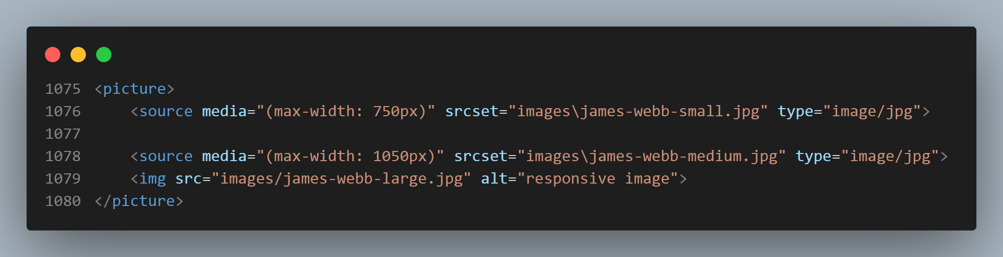
You can check the details of this feature at MDN Web Docs.